

Overview
AIDO is a Health-Tech company that focuses on giving the best and efficient solution for hospital and clinic management. Supporting hospitals and clinics around Indonesia, AIDO aims to give a thorough end-to-end digital management implementation for their partners’ healthcare ecosystem.
Role
As the product designer, project manager, and researcher for this project. I collaborate with AIDO’s design lead, worked with product managers, implementors, developers, and doctors.
Brief
Current design:

Main problems:
Confusing and hard to use.
A lot of pop-ups to enter patient details.
Overall design failed the contrast checker.
Crosschecking back and forth.
A lot of data validation to process the patient's treatment.
Down time and unknown errors.
Design Goals
Redefine visual information & structure
Improve data input workflow
Introduce a new concept
Planning
1 week to create design concepts.
1 week to conduct concept testing in Manado.
7 weeks to finalize design.
Scope
Product module:
Doctor
Admission
Nurse
Pharmacy
Cashier
Focusing on Doctor's module with patient details.
Design Concept
Initial design:

Change the the color for better contrast.
First iteration:
Testing out different layouts.
Second iteration:
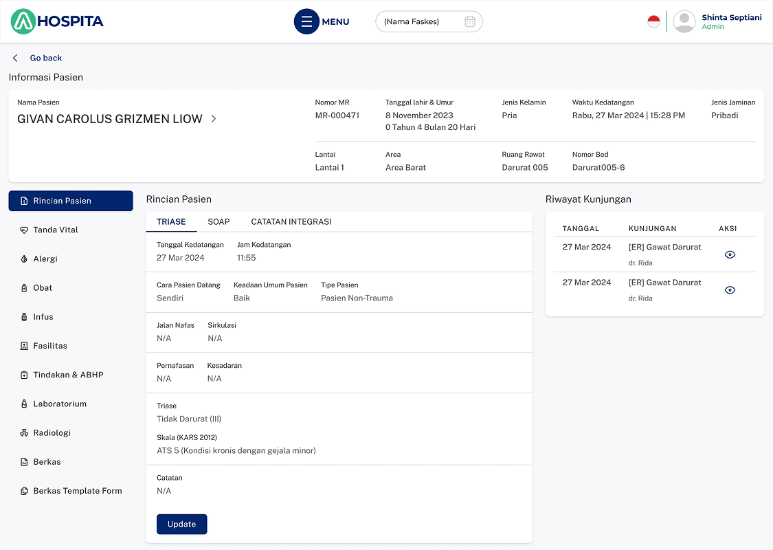
Broke the layout, give full visibility, and no pop-ups for data entry activities.
The client agrees with this solution and decided to put it to the test with the users.
Concept testing
The client flew me to Manado and test the design over there with the doctors.

We received positive feedback and additional requests to improve the design even further.
Concept test result

All doctors like the new design and layout. They're so excited and asked us if the solution can be implemented right away. The best comment we received from the senior hospital management was: "This is what we are looking for".
And with that, we can confidently say that this design solution is really what they need.
Mini Workshop
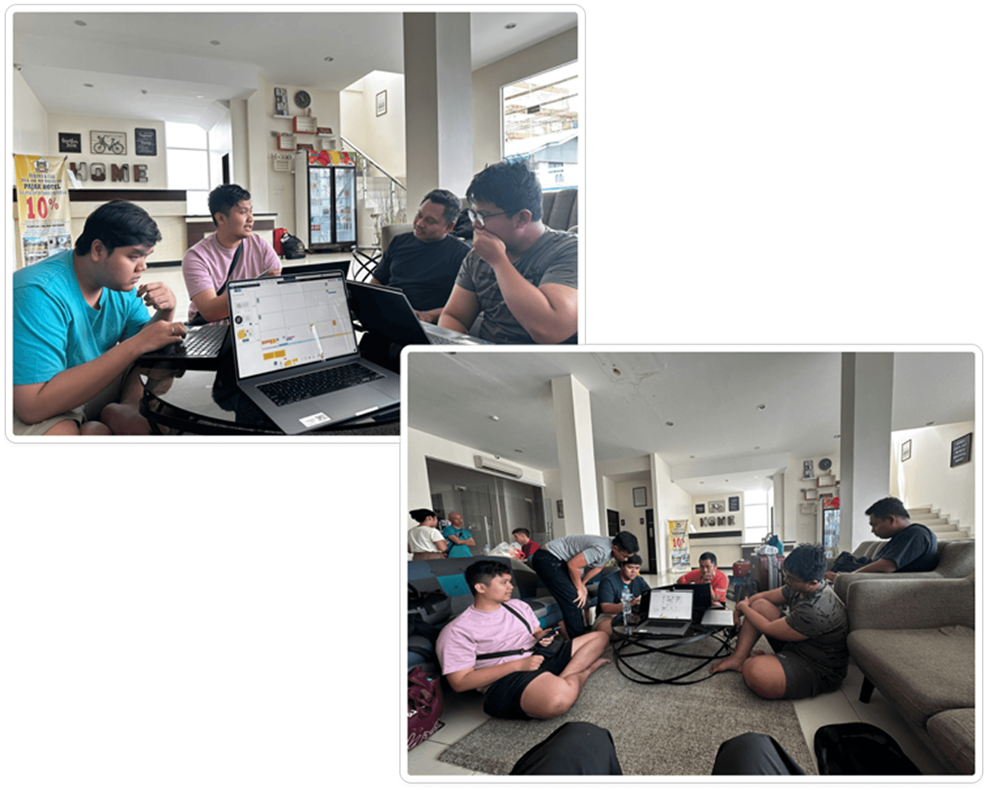
I asked the SolDev team to verify the existing complaints and update them if there are any. They helped me to document the complaints, feedback, and pain points.

The complaints mostly about bugs, process blockers, and other technical issues.
The negative experiences expressed by the doctors were about how time consuming and unable to go home as planned.
New suggestions:
Add notifications
Patient queue number monitoring & information
Stock management for the pharmacy
Templates for data entry involving medicine input
Next focus
Heading back to Jakarta from Manado - Gorontalo - Palu. It's time to put the findings and insights to work on the Doctor module with it's sub-modules. There are 3 of them:
Emergency (IGD)
The sub-module handling emergency patients.
Inpatient (IPD)
The sub-module for inpatients that are admitted to stay in the hospital for treatment.
Outpatient (OPD)
The sub-module for outpatients that needs for a quick treatments.
Widget list
I worked with the product design manager and look into the existing features. We decided to call them widgets because there are several of them used in other sub-modules.
Widget Name | Used in |
|---|---|
Alergi | IPD, IGD, OPD |
Lab | IPD, IGD, OPD |
Radiologi | IPD, IGD, OPD |
Tindakan & ABHP | IPD, IGD, OPD |
Obat | IPD, IGD, OPD |
Infus | IPD, IGD |
Makanan | IPD |
Berkas | IPD, IGD |
Berkas template form | IPD, IGD |
Fasilitas | IPD, IGD |
Konsultasi spesialis | IPD, IGD |
Tindak lanjut pasien | IPD, IGD |
LML | IPD |
LMA | IPD |
Terapi | OPD |
Pemeriksaan fisik | OPD |
We summarize 19 widgets to design with each widget have 3 states.
Timeline

Design team
I have 2 designers to help me on this initiative. They have been in the healthcare industry for almost 4 years. I had the privilege to lead and learn from them as the project went.

We decided to divide and conquer for the widgets list.
Design
Patient list (before)

The doctors can navigate and use the top page as intended.
Many pop-ups.
Hierarchy and readibility issues.
Patient list (after)
Remove pop-ups as much as possible.
Fix the visual hierarchy for better scanning.
Patient details (before)

Scattered visual hierarchy
Again, overuse of pop-ups.
Patient details (after)
TTV widget redesigned for a cleaner look.
Dynamic widget states for viewing the summary, details, & editting.
Widgets

In the end
We finished 2 weeks earlier because of the effective communication and strong commitment from the team.
We were able to catch different perspectives early on, manage expectations, and prioritize which features needed by the stakeholders, product, and developers for their product roadmap.
Client's comment:
