

Overview
A major hospital in Jakarta with millions of patient diagnostic records gathered by various doctors. Each records are documented in different ways. This initiative aims to organize the unstructered record documentation and improve internal communication between medical professionals.
My Role
As the product designer, I create the design screens, collaborate with doctors, project manager, data analysts, and developers.
How it went
I discovered the deadline for this project is less than 4 weeks. The good news, our team already decided on the features they want to build.

The project scope will start on Pediatrics. With the initial frames and feature scope done by the team, I was able to define the design expectations from the team and client.
Focusing on the users
No universal format for data entries
The basis are: purpose-based, symptom-based, or chronological-based.
Various terminologies
The words used are different between regions, individual writing styles, typos, and comments from the patients.
Long process and understanding of records from others
Doctors collaborate. Often they need to verify the patient's information with each other.
Wireframe

Dashboard
The page displays the summary reports in weekly, monthly, and yearly report along with other helpful statistics to monitor and manage new, processed, and validated entries.
List of entries
A list of entries showing details with the intention to display the ones need to be validated further.
Entry details & labelling
The page that will be used to label and validate entries with low prediction scores by the LLM.
Moodboarding

Visual references and interaction examples.
High-fidelity design: Dashboard
Initial design:
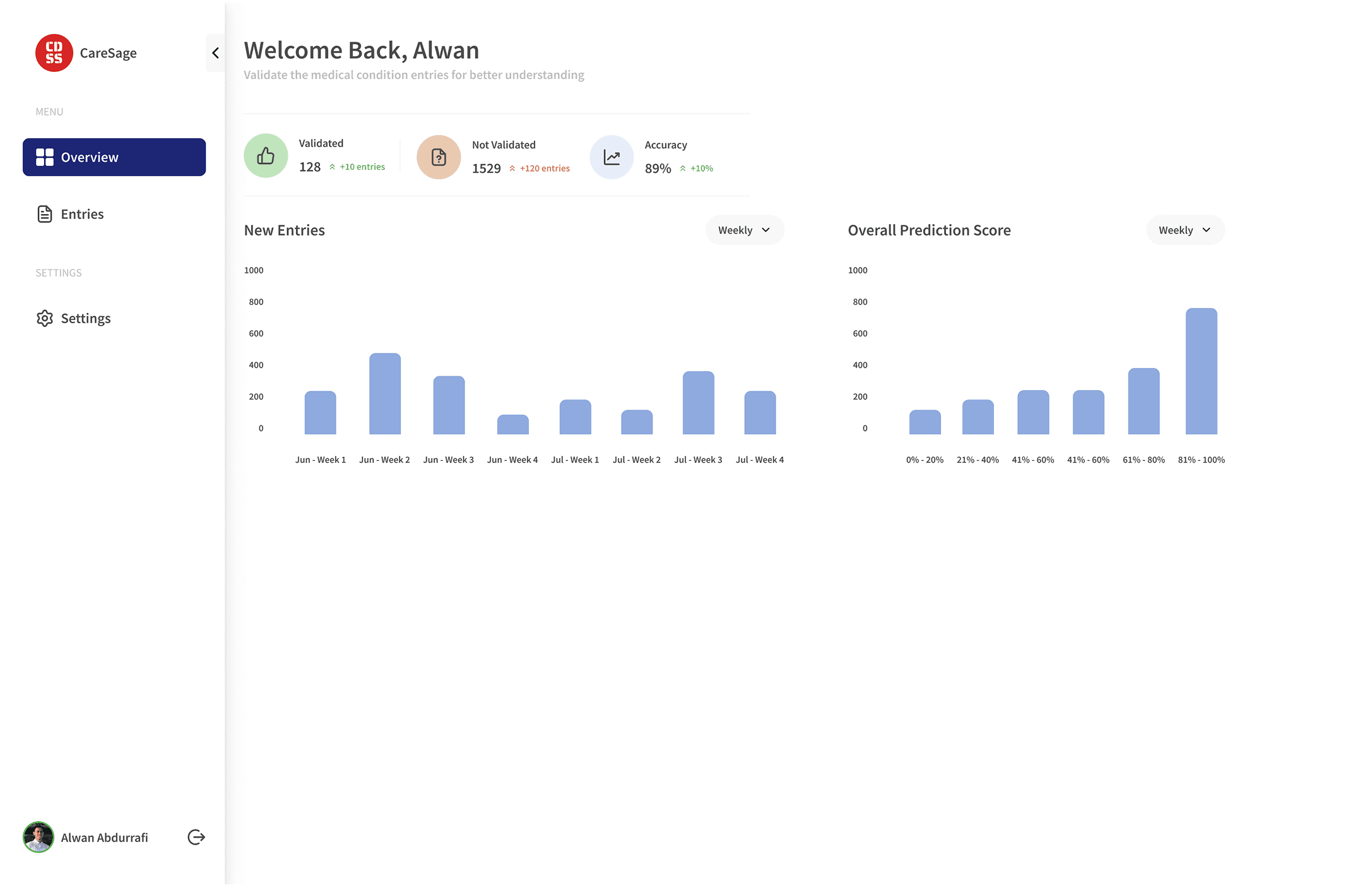
Feedback: Too simple and looks empty.
First iteration:
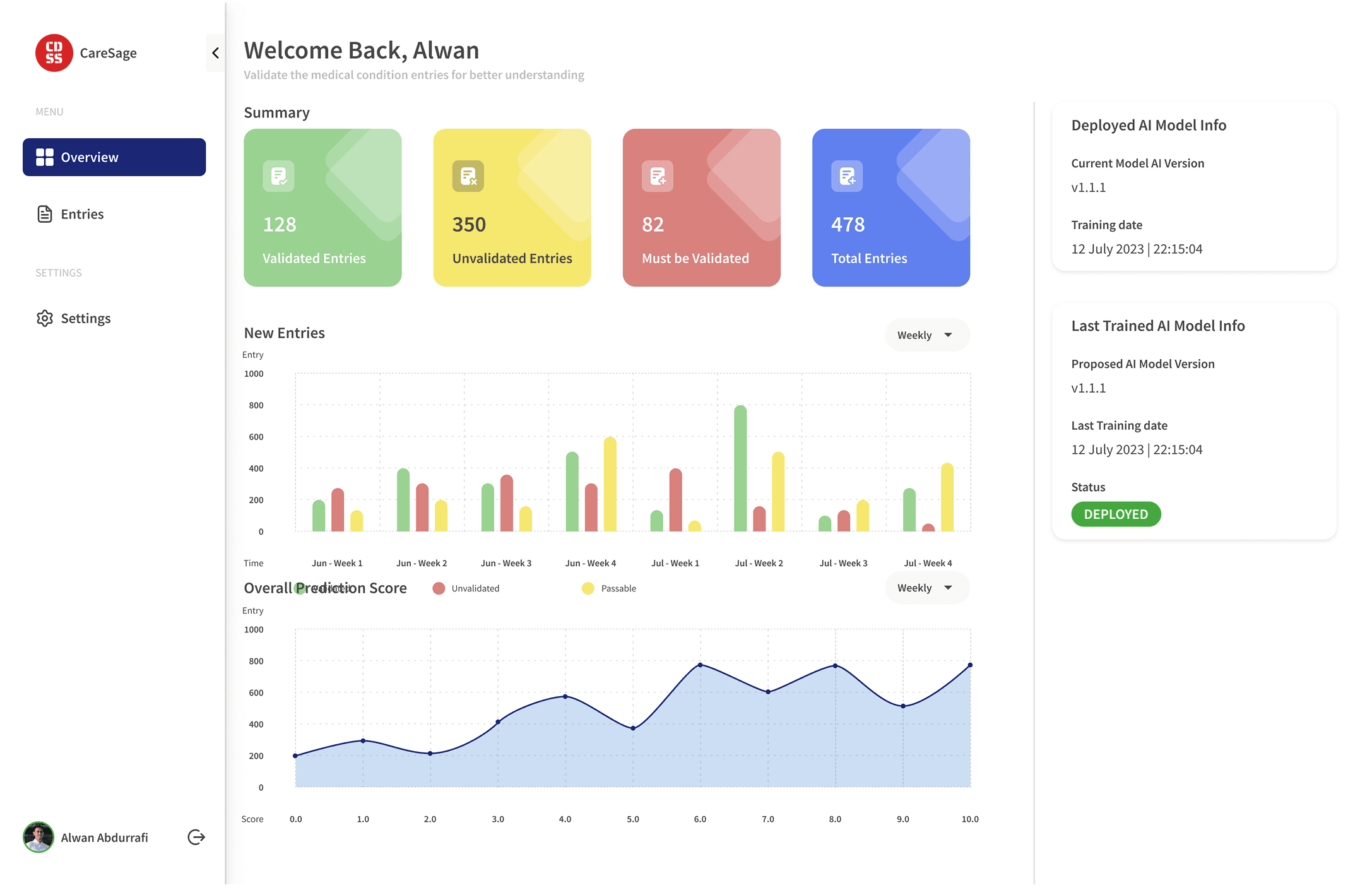
Feedback: Further adjust the summary cards for better spacing and information.
Second iteration:

Feedback: The client agreed for this design and we can finalize it.
High-fidelity design: Entries
Records validation page:
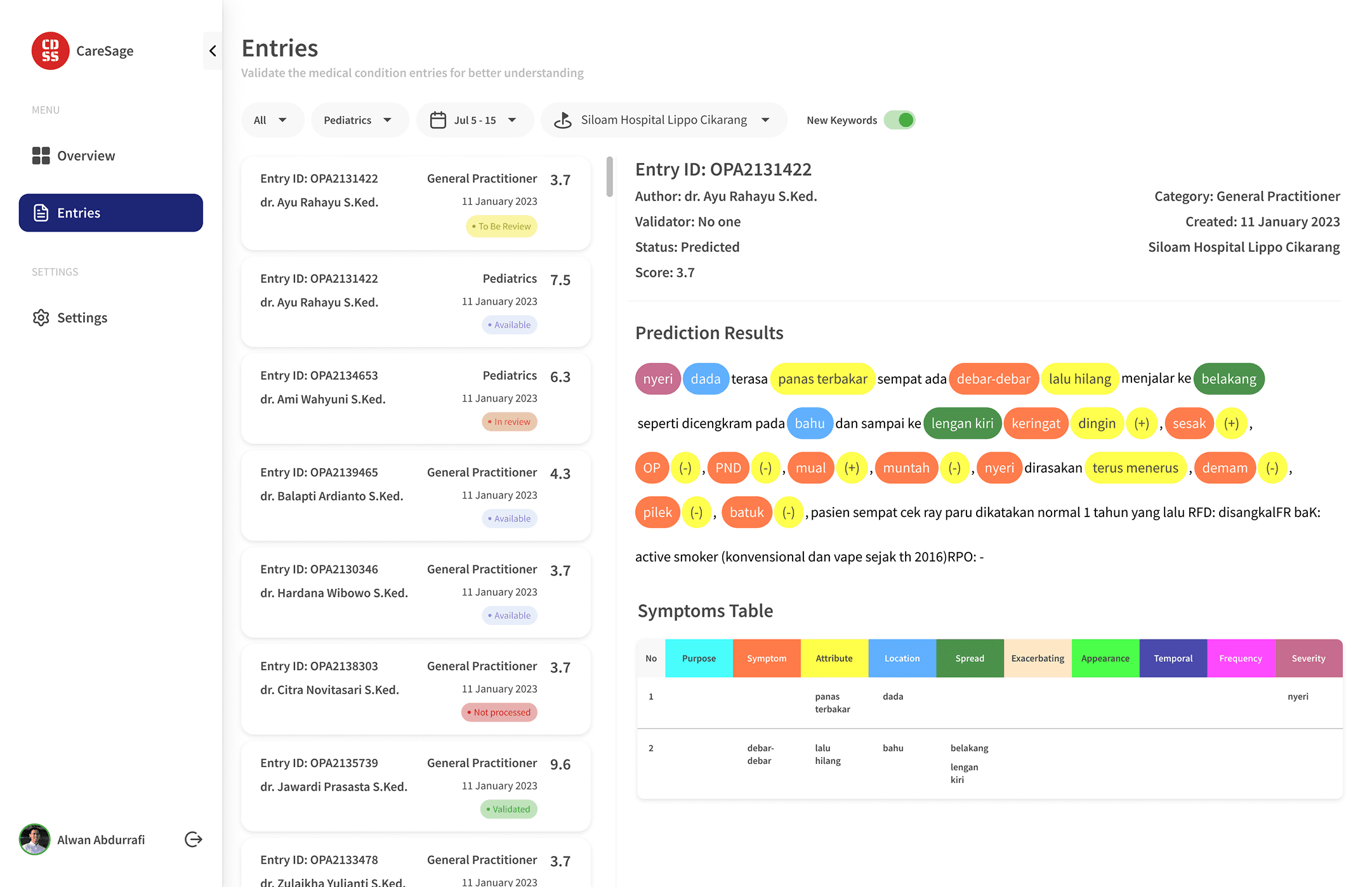
Feedback: all good.
Entry list:

Feedback: Simplify the filters to increase focus on the work area and simulate a page with unselected entries.
Entry list first iteration:

Feedback: By adding the selected state and "Edit Entry" button before doing any changes or updates makes it better for the user to validate the records.
Design prototype:
Deliver & development
With the positive response from the client, we were able to hand-off the design to the developers.
The team tested the web app. And the improvements needed before going live are:
Spelling correction
Text labelling
Structurization
Test results

The web app worked as intended by:
Normalizing local abbreviation & lingos
Fixing typos based on KBBI & medical references
Categorized words into 12 labels derived from medical framework & curated by medical experts.
Structuring text labels into tabular data.
Lesson learned
Always collaborate early and often with developers and client.
Communicate better with technical people to understand their needs and challenges.